Task The client, who had been working in the jewelry market for many years, had the task of launching a retail brand. He had already been working under a different name for an audience of wholesale buyers, who were predominantly men. Now, the task was to connect with a new target audience—active and sophisticated women. A new brand and a new vision were needed.
New visual identity - perfectly polished taste for jewelry
Based on the brand name and target audience, a brand structure was developed. It is simple and unique at the same time.
New visual identity - perfectly polished taste for jewelry
Based on the brand name and target audience, a brand structure was developed. It is simple and unique at the same time.
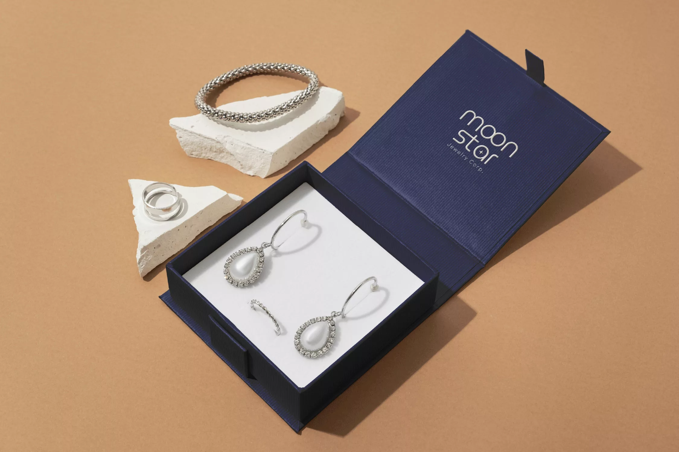
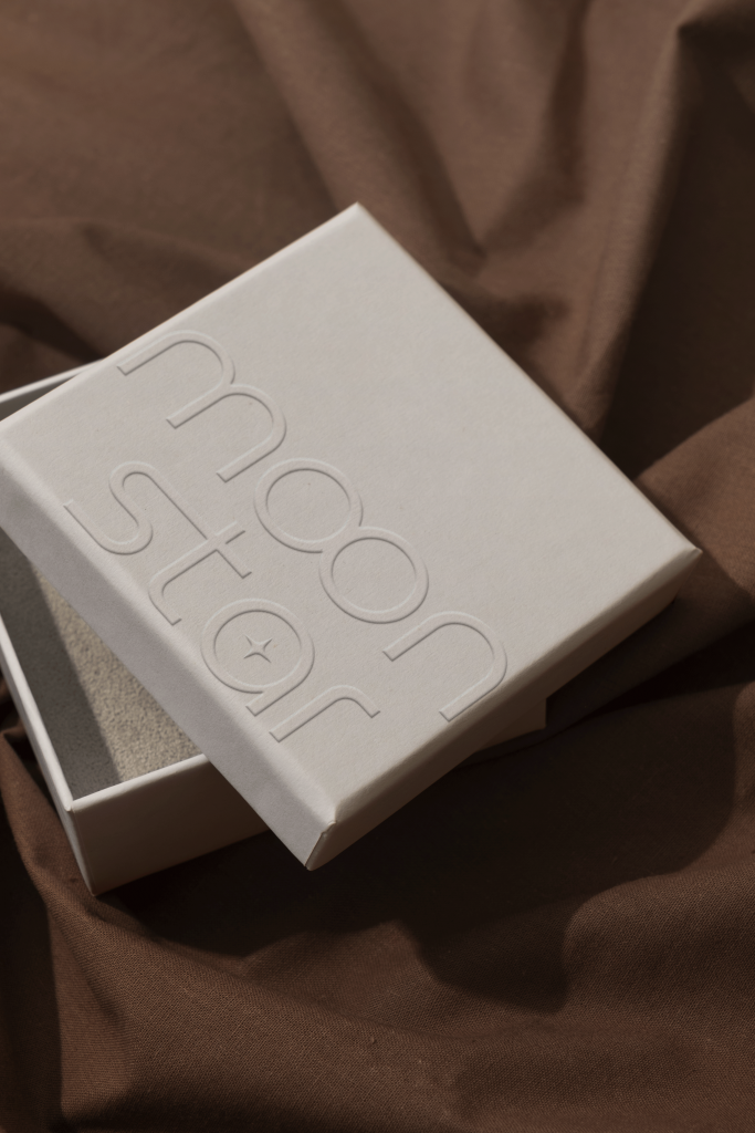
Logo
/ Foundations
Logotype
Logomark
Structure
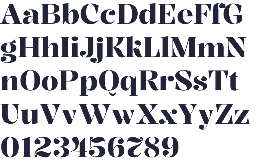
The logotype is minimalistic and elegant. It will undoubtedly remain relevant not only now, but also decades from now.
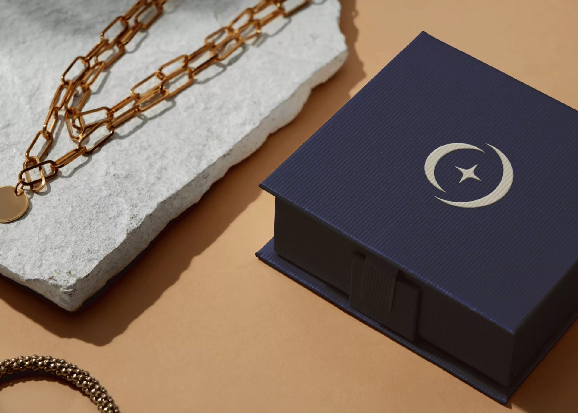
The brand symbol consists of two letters O superimposed on each other from the logotype. This technique created two crescent shapes, which correspond to the brand name. Additionally, it was decided to balance the design with a star from our logo.
The logo is very simple and unique at the same time. It has been verified through the trademark registration system, so the customer will be able to register it in the future.
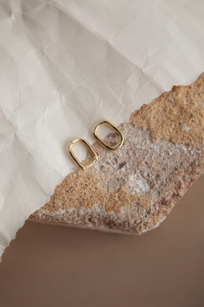
Color Palette
/ Foundations
#242539
Primary color
◯
Deep Space Onyx
#51516B
Secondary color
◯
Midnite Tanzanite
#A18C9A
Secondary color
◯
Nebula Amethyst
#CCB0A7
Primary color
◯
Soft Pearl
#F2E9E4
Primary color
◯
Moonstone Silk
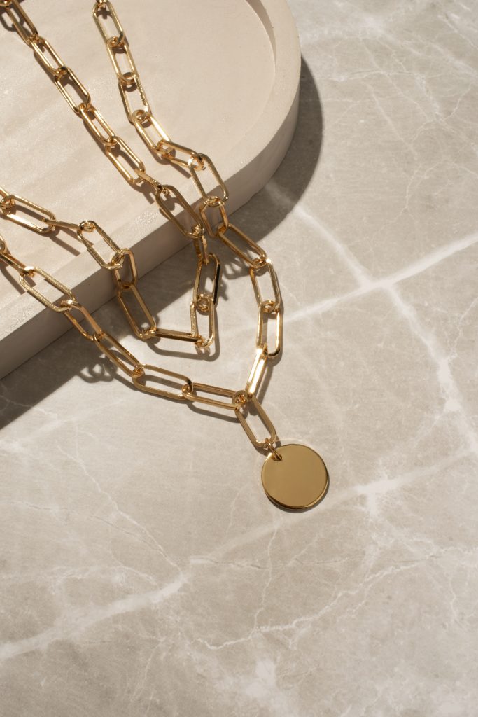
When creating the color palette, I was inspired by the theme of the starry night sky. The choice of pastel colors is not accidental, as they beautifully emphasize the sparkle of gold and diamonds without drawing attention to themselves.